B2B Payment Onboarding & Merchant Account Workflows
Simplifying merchant account setup and payment configuration inside a fundraising platform.
img/Merchant_Account_Case_Study.png
Connecting payments to fundraising events
OneCause customers use merchant accounts to connect payment processing to fundraising events and platform workflows. The existing experience created confusion around account setup, connection status, and where users should go to manage or connect accounts.
This project focused on improving the merchant account experience through UX evaluation, clearer account states, and a more understandable path for customers configuring payment-related settings.
Account setup created avoidable ambiguity
Merchant account setup was a critical part of the fundraising platform, but the experience created avoidable ambiguity for customers trying to connect or manage payment accounts.
Customers needed to understand whether they already had a merchant account, whether an account was connected, what status it was in, and what action they should take next. The experience needed to make account setup and payment configuration clearer without adding unnecessary steps.
Two paths customers kept confusing
The existing flow created confusion around two common paths: creating a new merchant account and connecting an existing one.
Customers who already had an account could still be drawn toward the "Create Merchant Account" action, while other users needed clearer guidance for connecting or managing an existing public account. Account status, setup progress, and available next steps were not always easy to interpret at a glance.
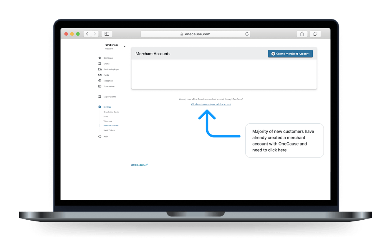
Crop from img/Merchant Accounts 2-min.jpg, save as img/merchant-account-cta-annotated.png
Helping customers find the right action
How might we make merchant account setup easier to understand while helping customers quickly identify the right action based on their account status?
The experience needed to clarify
- Whether an account already existed
- Whether an account was enabled, pending, or disabled
- Whether the user needed to create, connect, or manage an account
- Which merchant account should be used for payment-related configuration
- How to reduce unnecessary confusion between new-account creation and existing-account connection
Three questions to answer at a glance
I focused the design direction around clearer account visibility, more explicit status states, and improved guidance for connecting or managing merchant accounts.
The goal was to help users answer three questions quickly:
What merchant accounts exist?
What is the status of each account?
What action should I take next?
Account visibility
Make merchant accounts easier to scan and manage from a centralized view.
Status clarity
Use clear status indicators so customers can understand whether an account is enabled, pending, or disabled.
Connection guidance
Make the path for connecting an existing account clearer so users do not default to creating a new account unnecessarily.
Payment configuration context
Help users understand how merchant accounts connect to payment setup and event configuration.
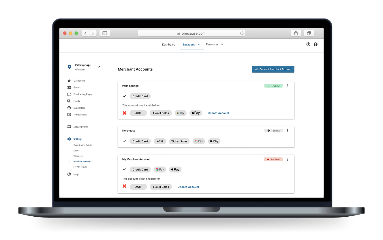
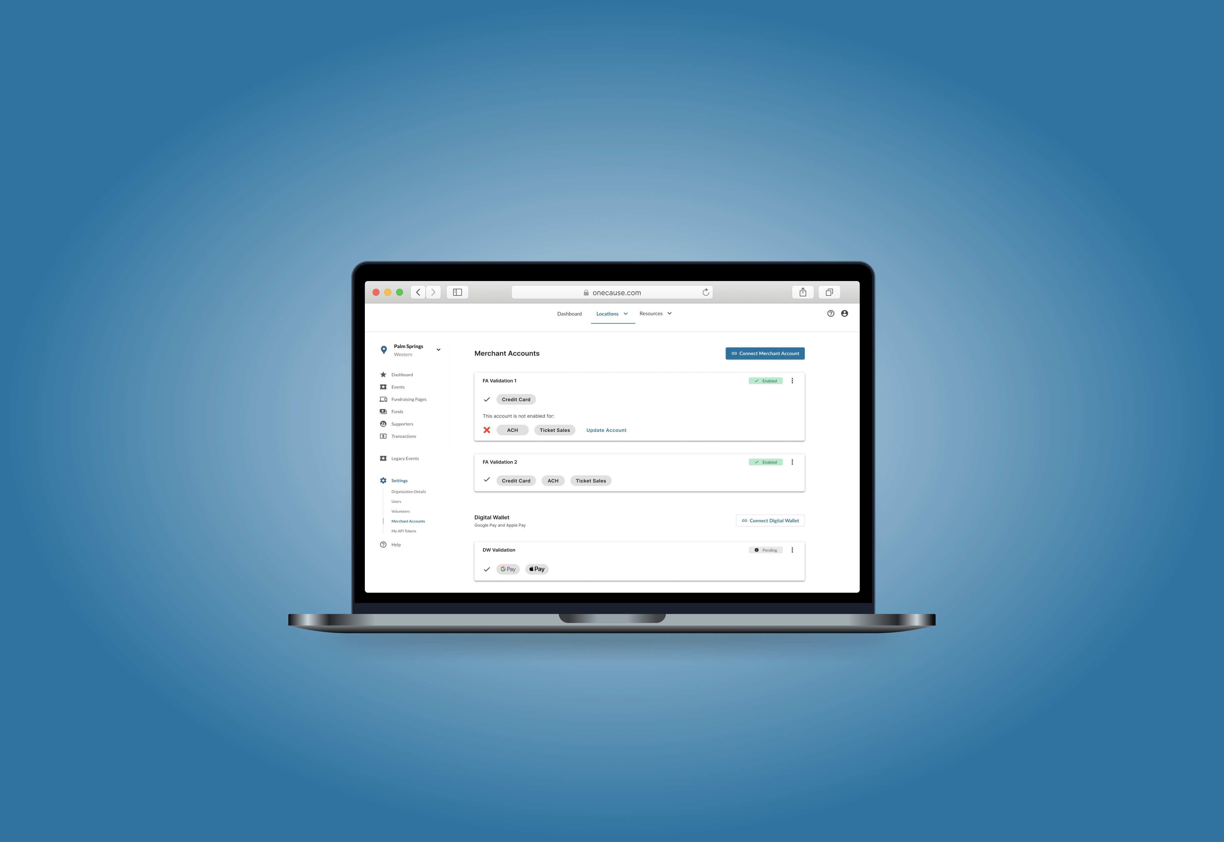
Crop from img/Merchant Accounts 1-min.jpg, save as img/merchant-account-list-status.png
A more structured account experience
The updated direction emphasized a more structured merchant account management experience, with clearer account rows, status indicators, and entry points for creating, connecting, or managing accounts. For event-level payment setup, the experience also needed to support selecting the appropriate connected merchant account so users could understand how account configuration related to specific fundraising events.
Make account status visible in the list view
Separate new account creation from existing account connection
Provide clearer guidance for customers who already had an account
Preserve the relationship between merchant accounts and event payment settings
Use high-fidelity desktop UI patterns that fit the existing OneCause platform
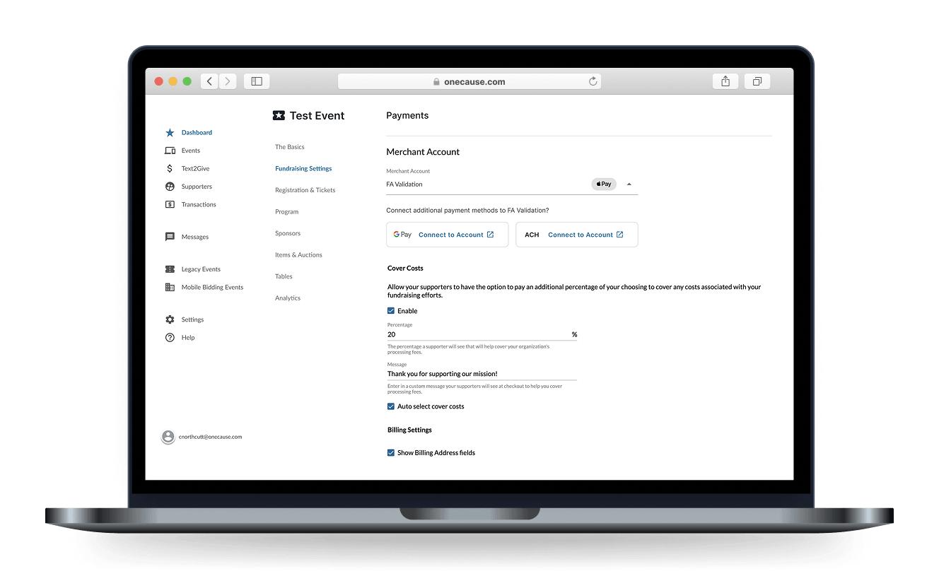
Crop from img/Merchant Accounts 2-min.jpg, save as img/merchant-account-payment-config.png
A clearer path for managing merchant accounts
The resulting design direction clarified how merchant accounts were displayed, understood, and connected inside the platform. It gave customers a clearer path for managing existing accounts, creating new accounts when needed, and understanding how merchant accounts related to payment configuration.
This project shows how I approach B2B platform complexity: by identifying confusing decision points, clarifying system states, and designing workflows that help users configure important operational settings with more confidence.